

The Psychology of Visual Hierarchy – Guiding Attention Through Design
Design is not just about what people see. It is about what they see first.
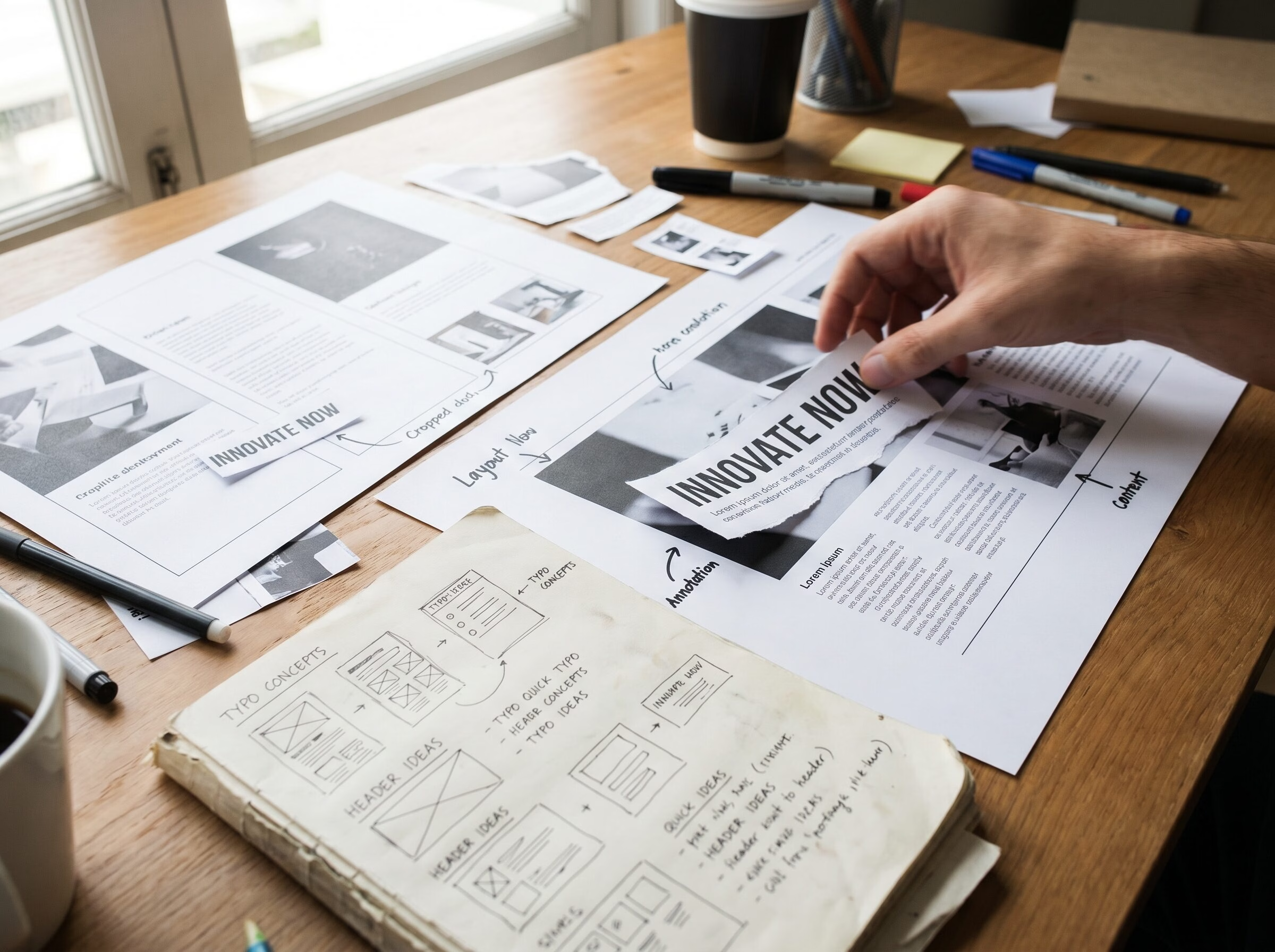
Design is not just about what people see. It is about what they see first.
Every design competes for attention. Whether it is a website, a poster, a magazine spread, or a brand identity, viewers are constantly deciding where to look first.
Visual hierarchy helps guide that decision. It creates structure and ensures that information is processed in the intended order.
Without hierarchy, even great content can feel confusing.
One of the strongest tools in visual hierarchy is scale.
Larger elements naturally attract more attention than smaller ones.
Designers use scale to establish clear relationships between headlines, subheadings, images, and supporting content.
Contrast creates distinction.
It can be achieved through color, typography, spacing, shape, or imagery.
High contrast helps important information stand out while supporting elements remain secondary.
People often underestimate the role of space in design.
White space is not empty space. It defines relationships between elements and improves readability.
If you’ve read The Importance of White Space – Design That Breathes, you already know that space is one of the most powerful design tools available.
Visual hierarchy is ultimately about communication.
Good hierarchy helps people:
Understand information faster
Navigate content more easily
Focus on what matters most
Make decisions with confidence
The clearer the hierarchy, the clearer the message.
Visual hierarchy is not decoration. It is a strategic framework that shapes perception.
Every choice of size, contrast, position, and spacing influences how people experience a design.
The best designers do not leave attention to chance. They guide it intentionally.
If you want your visual communication to become more effective and easier to understand, let’s create design systems that guide attention with purpose.
Because people cannot engage with what they never notice.