Rebranding for SOMMER.1916
- Client SOMMER.1916 / Monika Sommer
- Year 2012
- Used Software Adobe Illustrator, Adobe InDesign, Adobe Photoshop
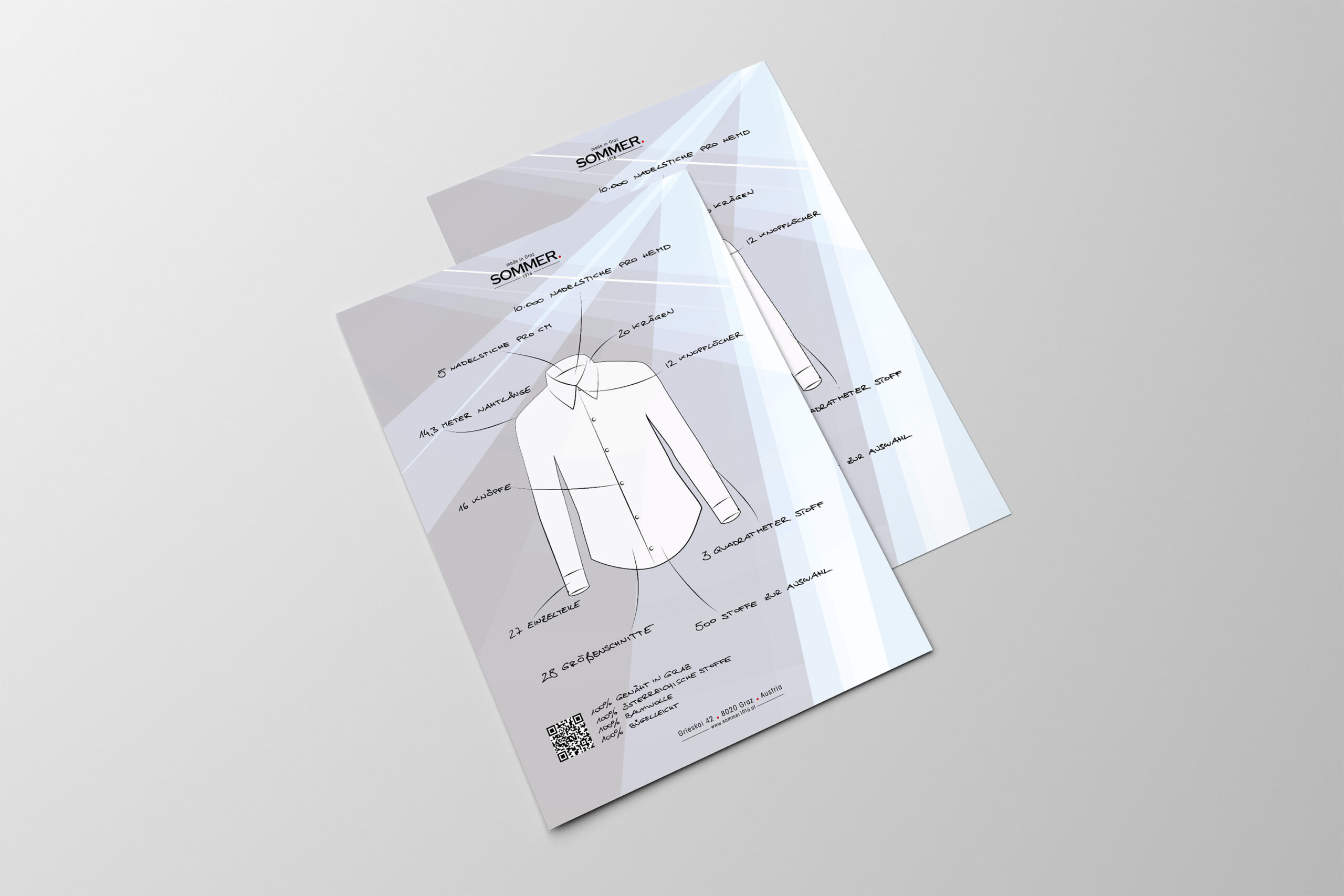
From Factory to Manufactory
For SOMMER.1916, formerly known as SIR Hemden, I led a complete rebranding that elevated the brand from a traditional shirt factory to a distinguished shirt manufactory. The goal was to blend the company’s rich heritage with a sophisticated modern identity, appealing to both loyal customers and a new, discerning audience.
I started by designing a refined logo, incorporating a subtle red dot at the end of the “1916” in the brand name. This design element was not only a unique brand mark but also extended into the product design itself, reflected by a red decorative seam around the button on the shirt sleeve, creating a seamless connection between the logo and the product. The typography balances classic elegance with contemporary flair, while the color palette emphasizes craftsmanship and innovation.
The rebranding encompassed various touchpoints, including business cards, product tags, and packaging, ensuring a cohesive and premium brand experience. By using my expertise in typography, brand strategy, and visual storytelling, I successfully conveyed the brand’s artisanal quality and forward-thinking approach, ensuring its legacy continues while positioning it for future growth.
This project showcases my ability to merge tradition with modern design, creating a memorable and elevated identity for a timeless brand.