Color Psychology in Branding: A Practical Guide
How to Use Colors to Emotionally Charge Your Brand

How to Use Colors to Emotionally Charge Your Brand
Whether we realize it or not, colors always trigger emotions.
In branding, color plays a vital role: It conveys values, creates atmosphere, and even influences decision-making.
So choosing your brand colors shouldn’t be random – it’s a strategic move in your overall visual identity.
Color psychology explores how colors affect human perception and behavior — emotionally, culturally, and cognitively. In branding, this means colors can build trust, grab attention, and shape how people feel about your business.
Here are some examples:
Color | Emotional Impact | Typical Brand Message |
|---|---|---|
Blue | Trust, calm, professionalism | Reliability, competence |
Red | Energy, urgency, passion | Action, boldness, emotion |
Yellow | Optimism, warmth, creativity | Cheerfulness, innovation |
Green | Nature, health, balance | Sustainability, calmness |
Black | Luxury, authority, sophistication | Elegance, exclusivity |
What emotions do you want to trigger?
Is your audience analytical or emotional, traditional or progressive?
Start with your core message. Your primary color should reflect your brand personality.
Colors carry different meanings across cultures.
Example: White stands for purity in Western cultures, but is associated with mourning in parts of Asia.
Choose a primary color – your brand’s emotional anchor.
Add secondary colors – for accents, contrast, or categories.
Define a visual hierarchy – not everything should scream at once.
Test across platforms – ensure your palette works in print and digital, light and dark modes.
Adobe Color: For testing color harmonies
Coolors.co: Quickly generate palettes
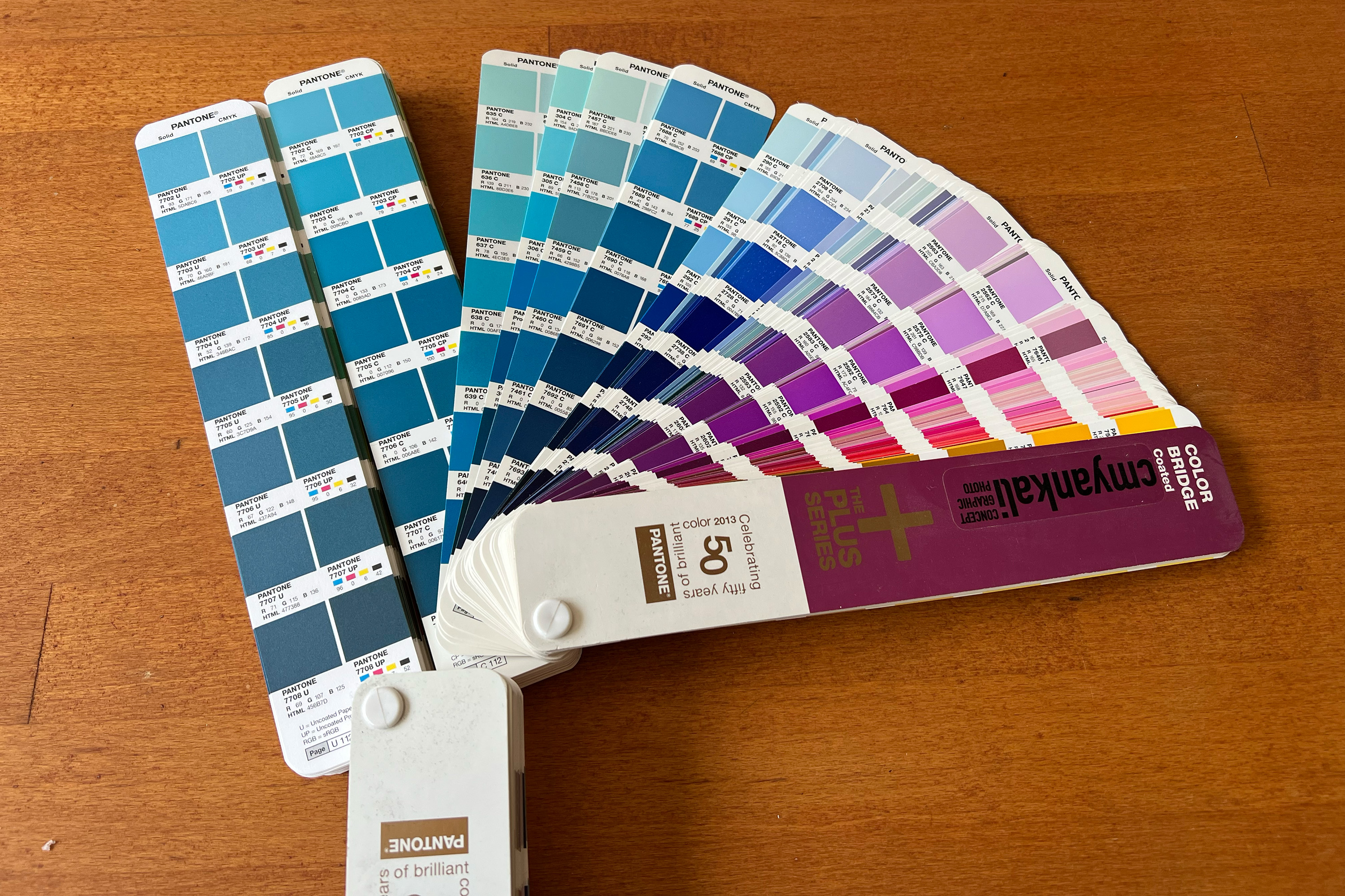
Brand Style Guides: Document your HEX, RGB, CMYK, and Pantone values
A thoughtful color palette doesn’t just make your brand look good, it makes it feel right. It sparks emotion, builds recognition, and connects with your audience on a subconscious level.
Use color intentionally – not accidentally.
I’d love to support you in finding a palette that fits your identity and speaks to your audience.
Get in touch – let’s make your brand stand out.